Color Blindness
Accessibility
Use-case 1:
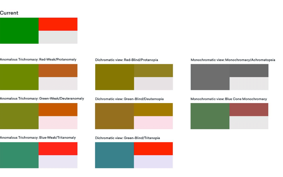
Problem: When digging into our user feedback (support tickets, twitter, etc) it became clear we had color blind users that were struggeling with understanding sunbursts, graphs, etc because we indicate a lot with color inside our portal. Roughly 4-8% of the visitors that visit a website or app are colorblind. 
To accomendate the same experience for all our users I started converting our current colors to "colorblind colors" so I could experience the same problem. When converting them I saw there were 3 types of colorblindness where the contrast would be barely visible for our current red and green colors (screenshot below).
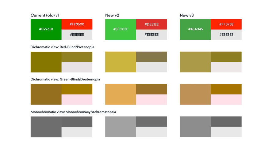
Experimenting: I started focussing on those 3 types of colorblindness and experimented with 5 versions of green and red to see which colors work best in terms of contrast and to present them to the team. I also added the versions into our coverage reach chart we use inside the Codecov Portal as an example. Our goal was to pick the colors with enough contrast but without compromising the look and feel for the non colorblind users too much.


As you can see above we were also trying patterns as an addition e.g. diagonal lines vs horizontal/vertical lines to even more differentiate between the colors.
After we've picked our version, it was time to do the same for our sunburst graph, which currently had 10 colors between green and red to indicate how much e.g. a folder or file is covered. The challenge (as you can see below) is that with a lot of colors its becoming nearly impossible to create a contrast from light to dark for our colorblind users.

I reduced the amount of colors to 7, 6 or 5 color versions. We have to take into consideration that each color indicates a percentage, so if we reduce the amount of colors we have a less precise idea of what the coverage percentage is, so naturally we want to have the most colors but on the condition that our colorblind users can still see enough contrast to tell them apart.

Solution: We picked for a 7 color variant (7 steps between 0% and 100% coverage). This would still give us enough indication of how much a file or folder is covered and it would still give us enough contrast for our color blind users. See the old and new sunburst below.
