Color
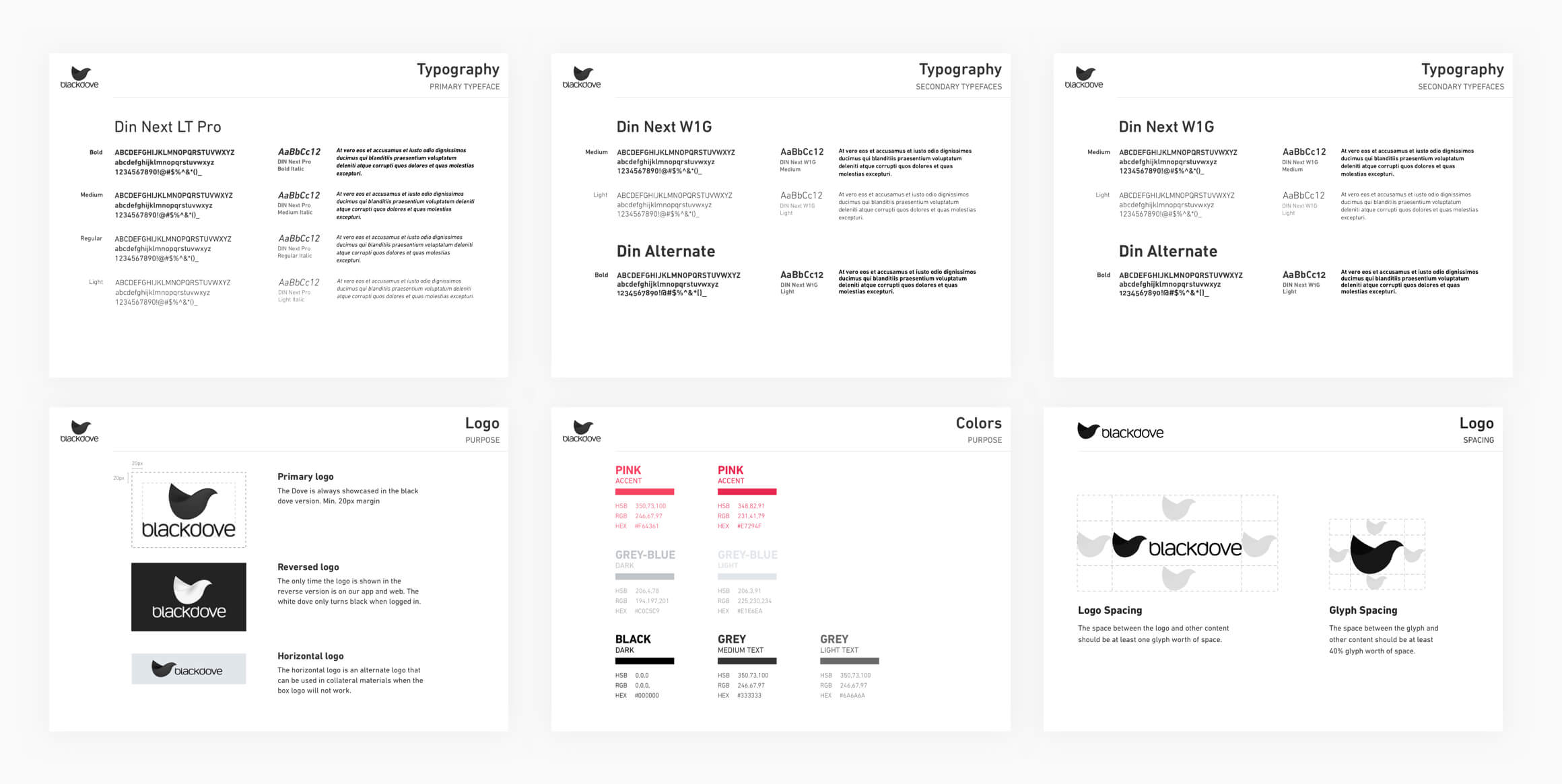
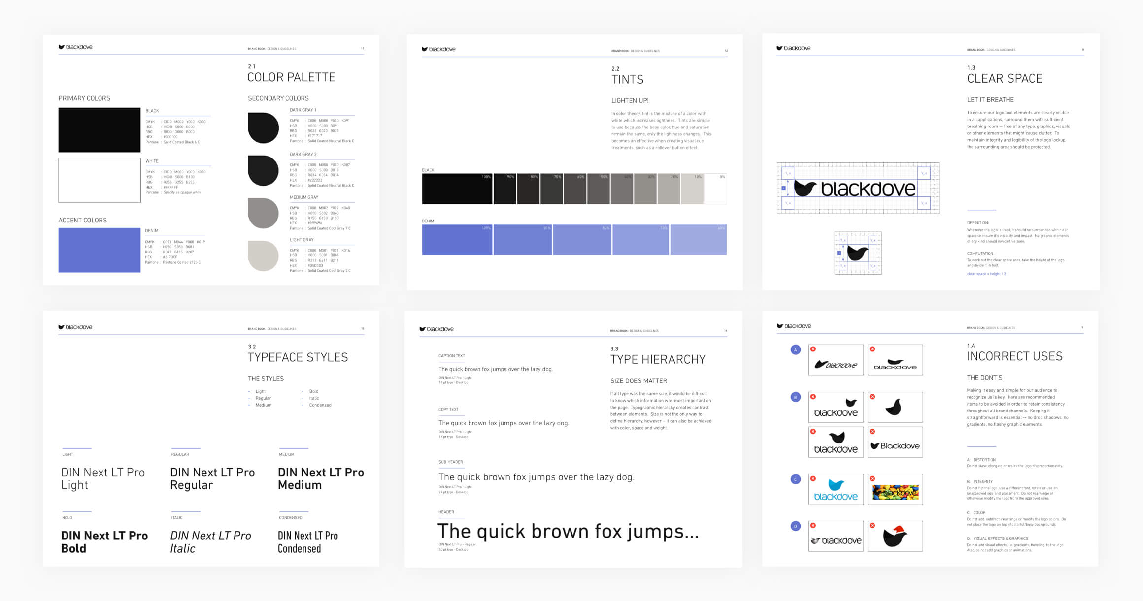
First we needed to change our pink accent color to a color which would be more sophisticated, creative, luxurious and would represent a (digital) art brand at the same time. Our new color became purple/blue.
Font
We reduced the amount of fonts from 3 to 1. The three fonts are very similar and could be easily reduced to 1 font for more consistancy across the board.
Logo
The next challenge was iterating the logo. It required to keep its brand recognition and we needed to improve the simplicity to gain more brand awareness and recall. The reversed white logo had to go, this would create too much confusion for our users since the name of the company was litarally "Black"dove. The stacked logo was removed too, the text Blackdove needed to be more present and the glyph of the logo should be presented next to the text and have a similar size so it would have the same level of importance. The glyph however could be used as a stand-alone element (e.g. on social, email marketing) but it should have the copy "Blackdove" near it on the same page somewhere when being used to create more brand recognition.
New brand:
UI-Kit
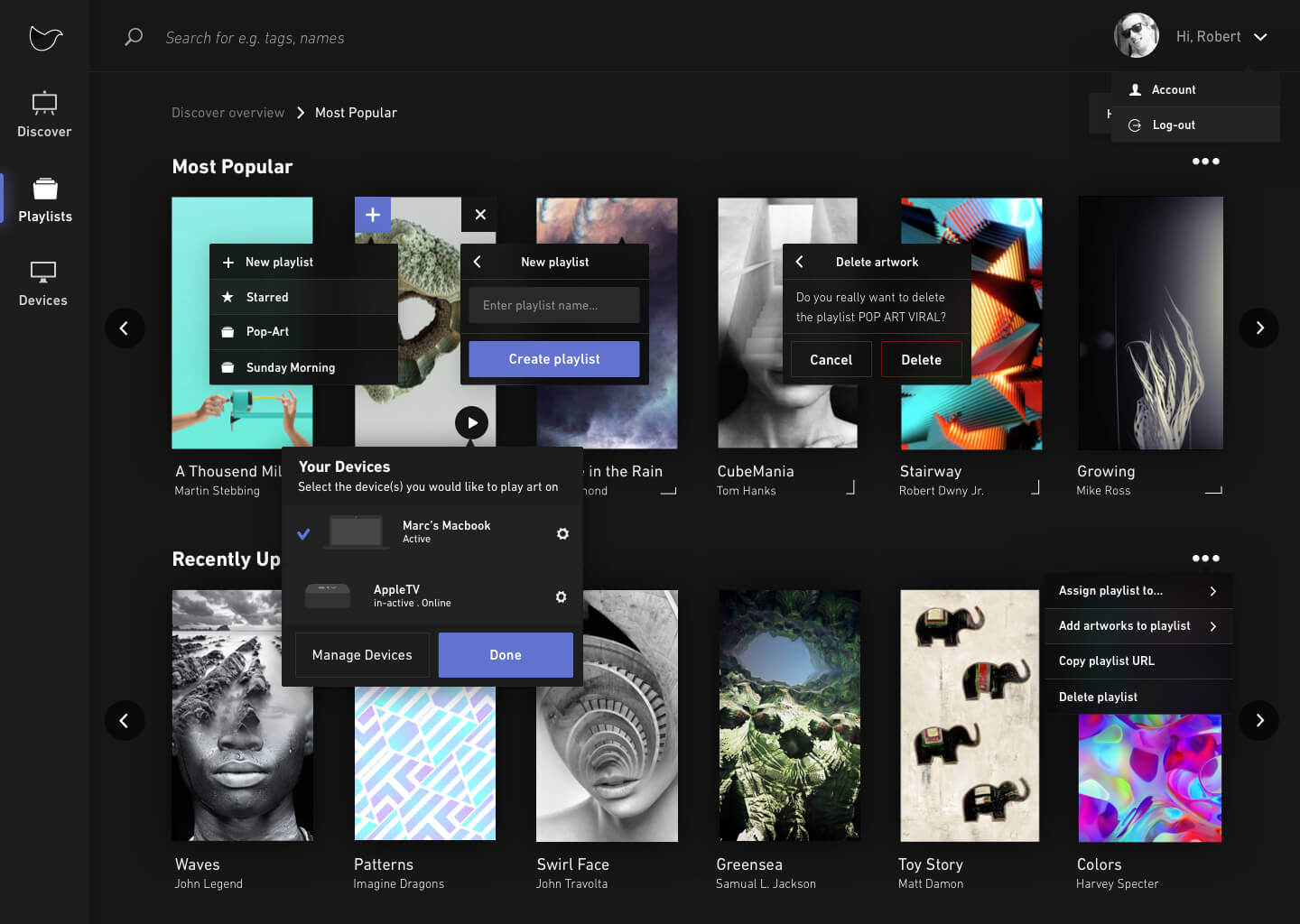
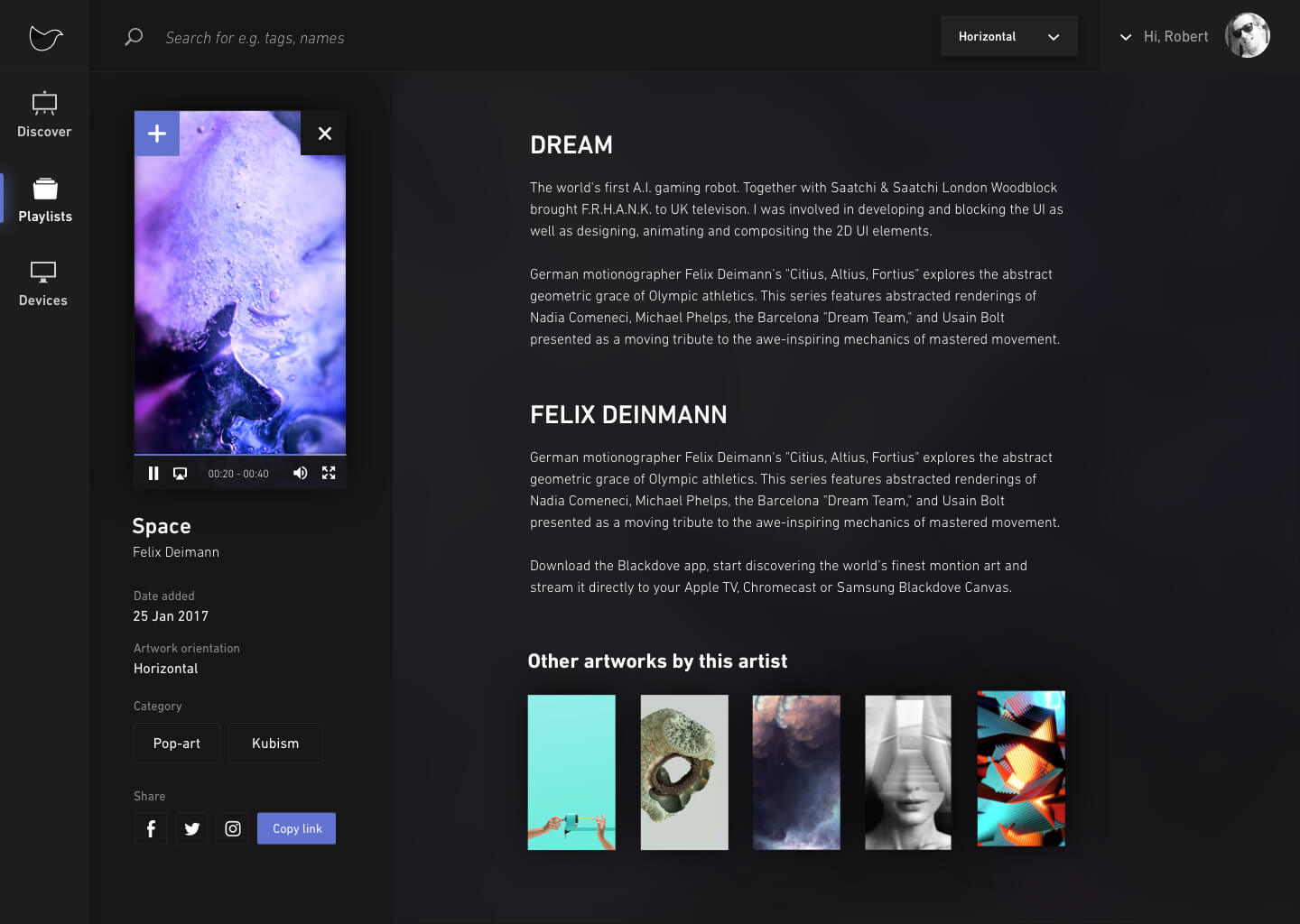
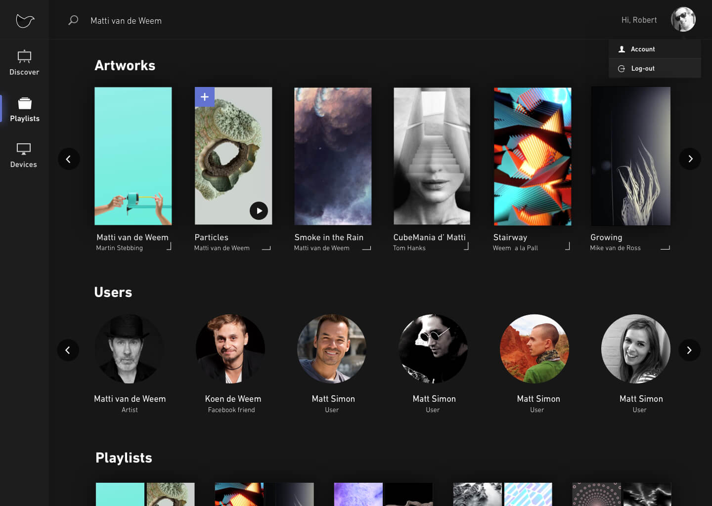
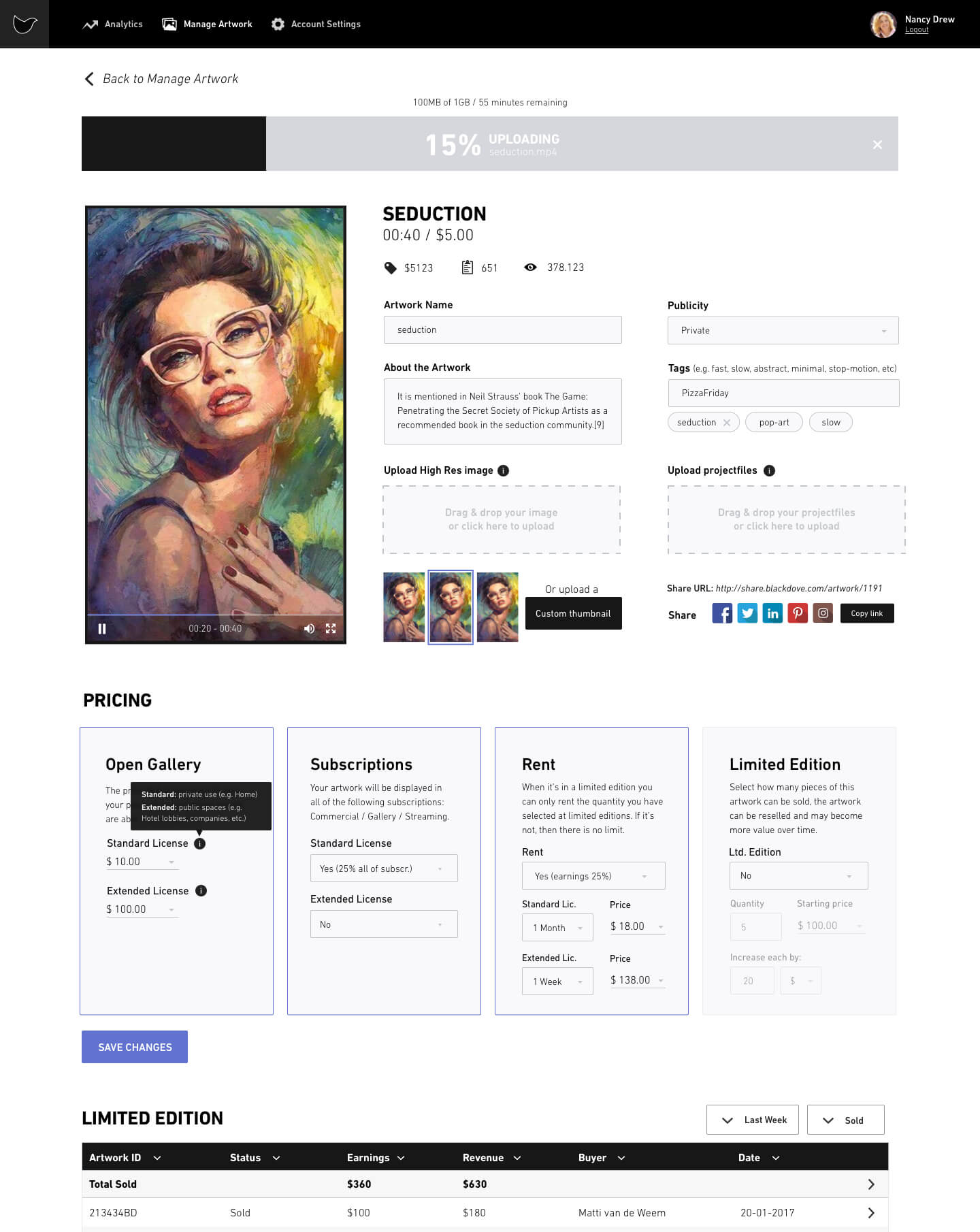
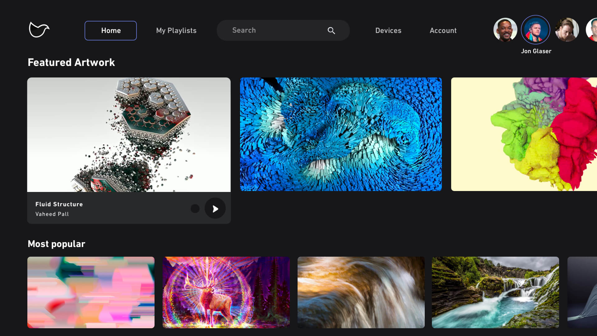
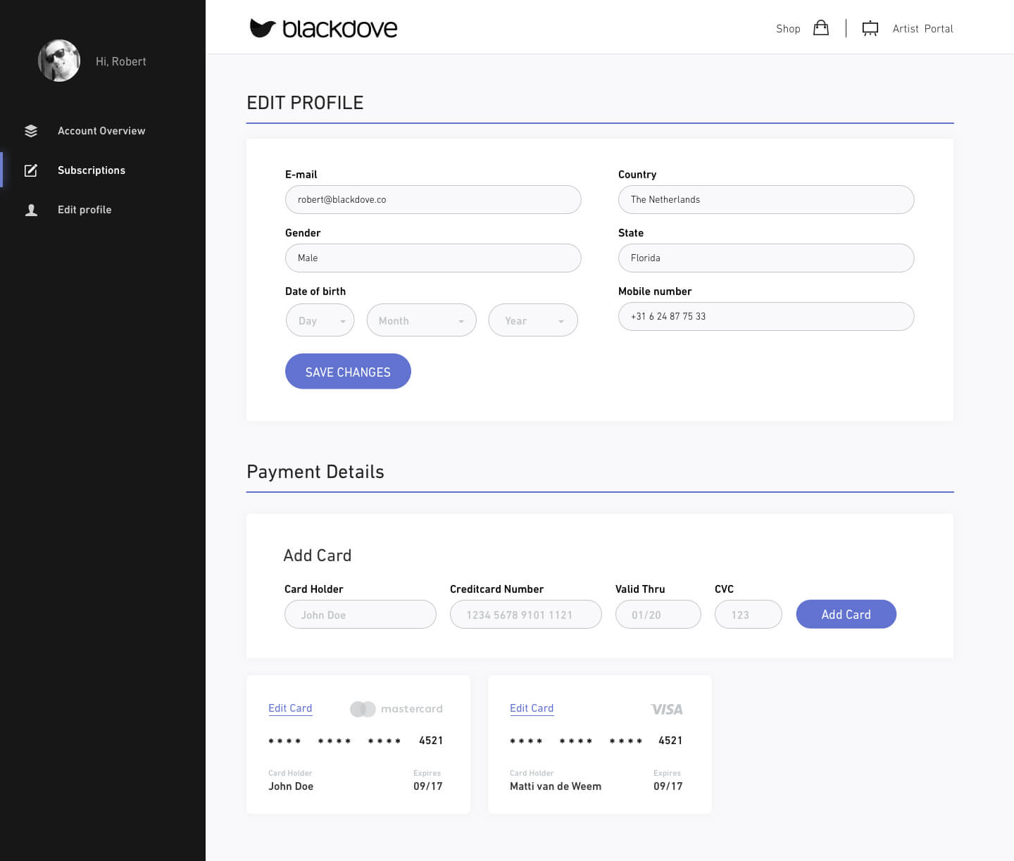
Now that we established the brand we could continue on all the UI-kit elements for the various Blackdove products (e.g. forms, buttons, lists, modals, dropdowns, etc), basically our own small design system. After designing all the elements I worked together with a talented front-end developer Koen who created a UI-Kit library from my designs so that it could be implemented in the front-end products. We created this design system for the Web so that it served as the basis for all future UI work. It was used to create all our features across our different Web products and was used as guidelines for the new features on our iOS, Android and TV apps. Having this design system, aligned the design of our apps which allowed people to seamlessly move between platforms. Overall it greatly improved the way people experience the Blackdove brand and for the developers to keep on-brand.
Time to create real customer value
With the UI-Kit and Branding in place I could focus on the product. It was time to review user feedback, problem-solve and prioritize our next set of objectives.
Mobile App
The mobile app is one of the core products of Blackdove. It controls the TV, let's the user discover art, create playlists and streams art to their tv's at home and work. We were eager to add more features but at that time we had a hybrid app and we knew we had to switch to a native app to prevent performance issues in the long run. So we did, this created the oppertunity to create new designs for the mobile app. I started with writing down all the ideas and features we wanted, creating user stories, reviewing user feedback, creating roadmaps and scoping out the features with the developers. This way we could prevent most of the flow issues for the future. After working out all the designs we could decide with the team on a MVP for a first release and kick-off the first sprint.
Flowchart
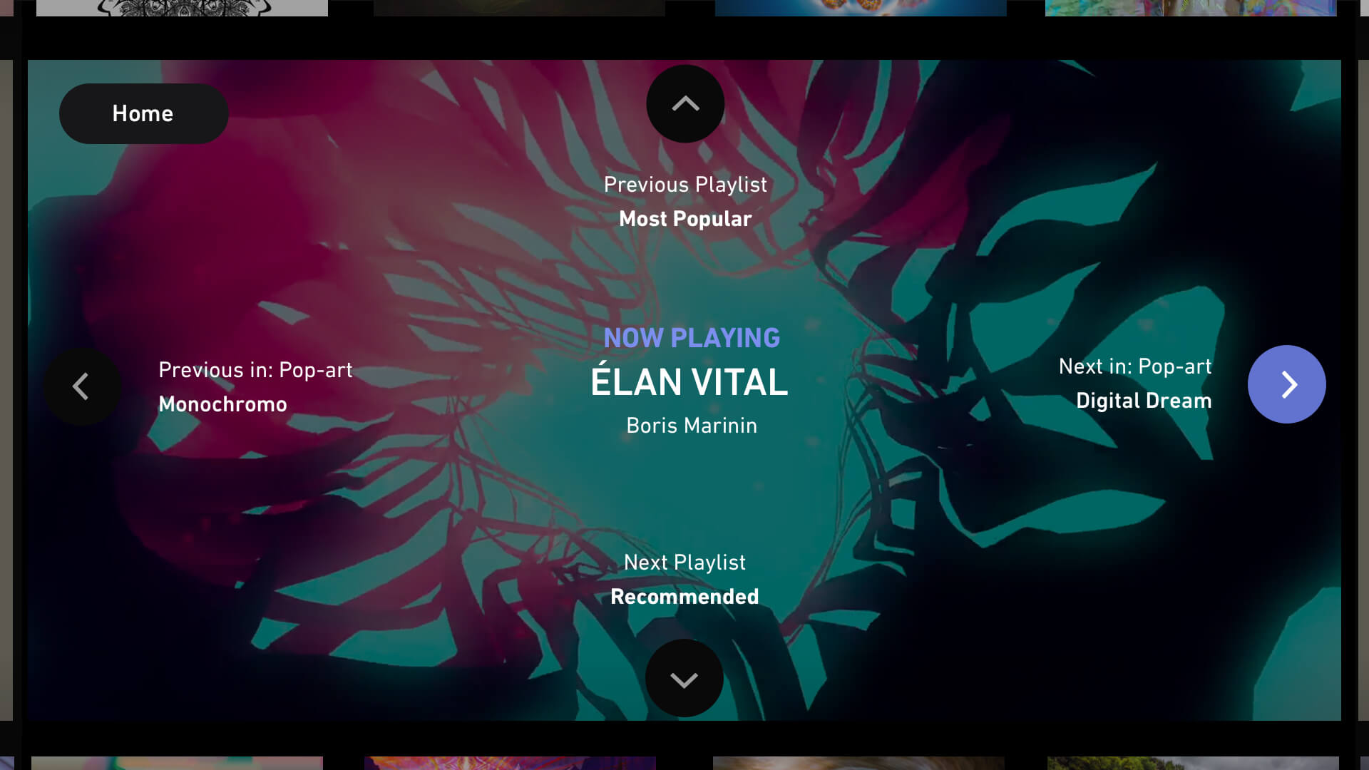
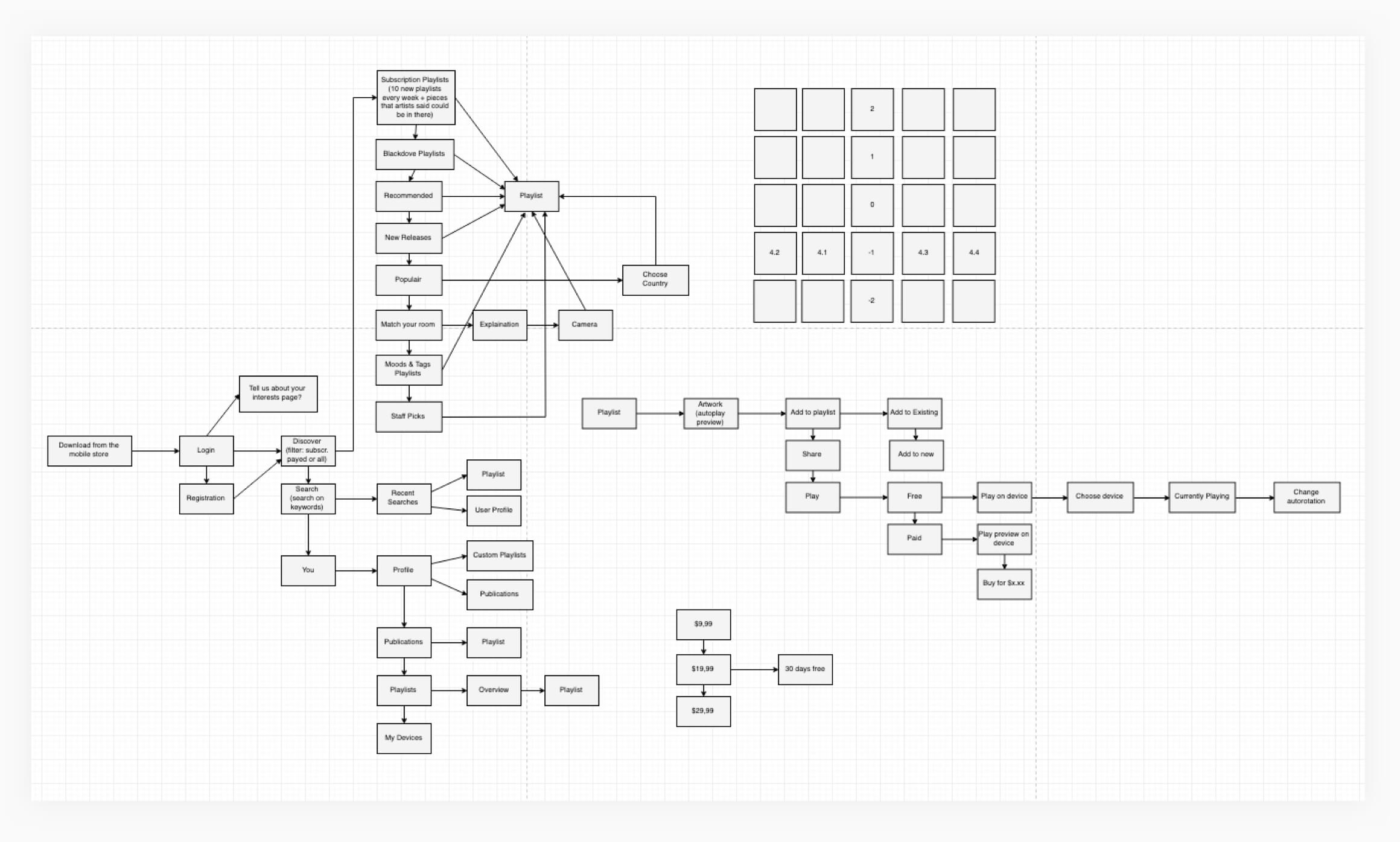
The tiles on the top right (image below) show the idea of swiping fullscreen artworks to left and right to discover artworks in the fastest way possible, swiping up and down would take the user to a next and previous playlist. When testing this functionality with our users we discovered that swiping left and right was a natural behaviour for them but swiping up and down through playlists had a learning curve for our users. This had to be fixed by adding an onboarding flow explaining this feature to our users.
Wireframes
Prototypes & Interactions
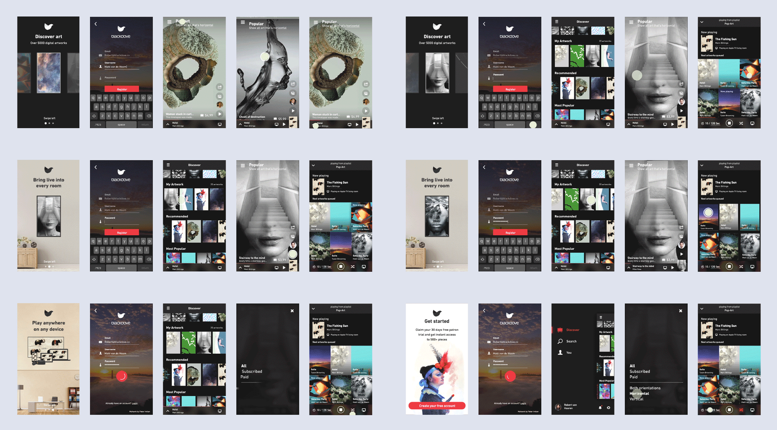
Below are a couple of our mobile screens with interactions from the v1 app (right before the new brand was finished). Interactions and animations should always be logical for the user to understand what's happening on the screen. Transitions shouldn't take longer than 0.5sec, so that users won't have to wait for an animation to finish. If applicable the interacted element should transition to a new screen or element, making it easier to understand for the user where they are and where they are going. Motion makes it clear when items are selected and what will happen when they’re released. The user’s touch should directly control the movement of elements. When animating an element to a destination, the speed of the user’s gesture should be matched by the speed of the element being moved across the screen.
V2 App
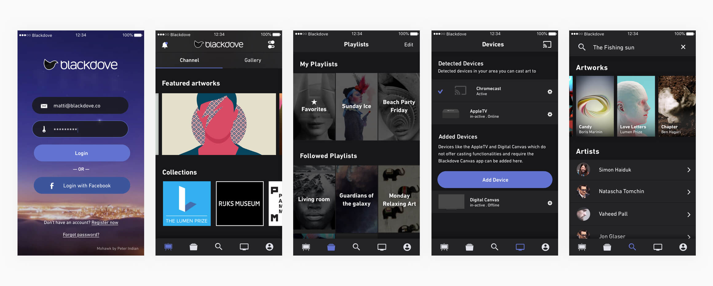
One of the big changes within this release was the transition from hamburger icon to bottom navigation and the new brand. We discovered that the hamburger icon would take the user too many clicks to get from one place to another, at the same time Material design started to take off and the bottom nav started to become a standard, because of these reasons we replaced our hamburger menu with the bottom navigation.
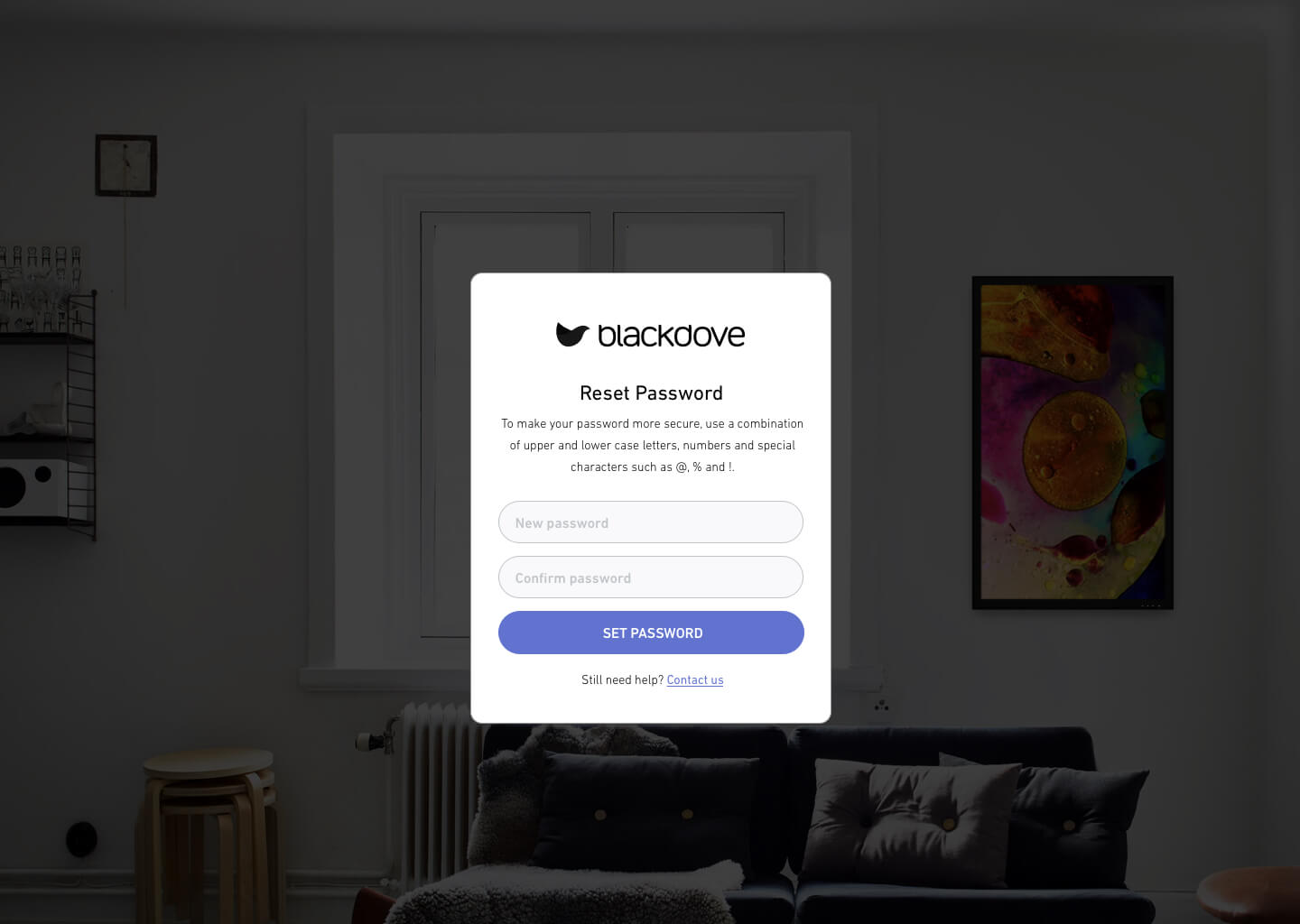
We also started to add rounded buttons to make them feel more clickable and less web like. We changed all our light modals to dark themed modals to make it more consistent with the rest of the app which also had a dark theme.
V3 App & Churn (CLV)
Since I started at Blackdove we saw a lot of churn happening when we looked at our KPI's. We didn't have a lot of active users or users that converted into paid subscribers. Now that I was finished with getting the new brand, native apps and designs in place it was time for me to focus on reducing the churn. When I looked at our social media and marketing strategy there wasn't a lot going on, our users didn't return back to the app in any way because they weren't getting notified.
The first step was just getting anything out to our users. We started with sending weekly artist & artwork emails to update our users that there were new artworks and artists ready to be discovered (the emails would link to a sharepage with the artwork and if viewed on mobile it would ask you to open them within the mobile app). We a/b tested this in various ways (with gifs vs still images, CTA copy, different subject copy, etc) to increase open rates and click rates. We were posting moving previews of artworks on Social media (focusing on Instagram and Facebook).
At the time within the app our users needed to enter their creditcard details first before getting their subscription. We wanted to change this to reduce the hurdle by implementing a freemium model (7, 14 or 31 day trial period and a/b test between the three periods to validate the best conversion rate).
We needed a direct way to get the attention of our users, we wanted to notify our users by sending them push-notifications from the mobile app, letting them know: new artworks became available from the artists they are following, friends that invite you to check an artwork, users that are following you or one of your playlists, etc. By sending our users push-notifications we would be reminding them that they have our app on their phone and this way they would be more likely to return to our app.
Adding the new features created an oppertunity to add new interaction and design improvements. Within the phone industry screens started to get bigger and rounded screen corners became the new standard. When this happened the designs of some mobile apps shifted to elements with a border-radius, this would look more consistent with the screen. At that time I wasn't sure if this was going to be picked up but I assumed this would happen so I took the risk of going into this direction with the new designs. When applying it to the current designs it already started to feel more consistent. After a while Snapchat, Gmail, Facebook, IGTV and a few others started going into the same direction.
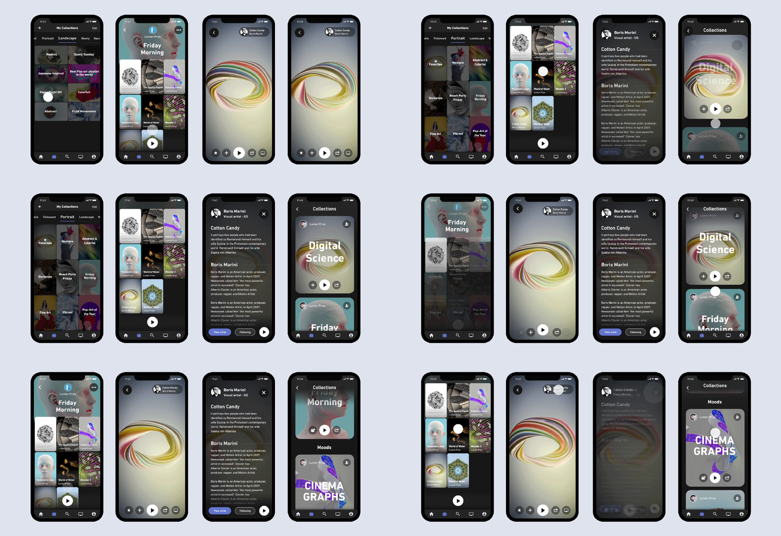
The above animations needed to be smooth, subtle and have a bouncy effect. The bouncy effect is based on the new App Store animations from iOS.
It was great to see that during the app improvement journey users started to like the new improvements:
"Very cool app" - Lebowskiq O
"Slick app and nice idea" - R Mukerji
"Awesome App! I seriously love the concept, design and the UI." - A Google user
"I love this app. We actually own the screen with the app built in. We have it set up on our lobby and its wonderful. Wonderful to have beautiful digital art streaming in our lobby. It was a buggy but the last update has me in love again" - S Hertigan
"As you may know, I headed a business software development company for decades. That’s why I tested the platform in various ways. The UI is one of the best I’ve seen in a long time! Congrats for that." - S Adard
Takeaway
Learn from your users, a/b test, reflect, review and improve to push your product to the next level. This article described one of the many products (I will list the other products below with some additional images) I've worked on during my 3 years at Blackdove. Whitin this article I've mostly focused on the design, the article would have been too long if I would get into the other products or my role as team lead.
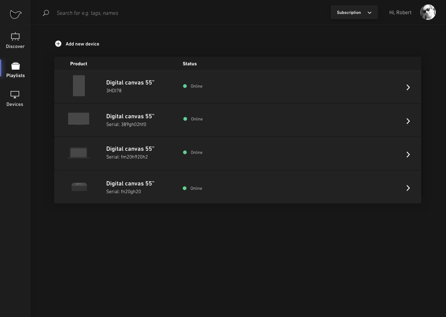
Blackdove products I've worked on besides the Mobile App and Branding: Blackdove.com | Web App | Account Portal | Artist Portal | Reseller Portal | Staff Portal | Receiver Apps (Android tv app, Appletv app, LG tv app, Samsung tv app, Vizio tv app, etc)
More Blackdove
Some of the other Blackdove products I worked on:
Wanna see more?

Code coverage is one of the most important metrics companies rely on to ship healthier code, faster, and with less risk.
Project Date: 2019 - 2022
Design: UI / UX / Marketing
Location: San Fransicso (CA) US

Blackdove is on a mission to connect the world in a shared art experience. Art can now be viewed in an authentic way by a global audience.
Project Date: 2016-2019
Design: All
Location: Miami (FL), US

The programmable network edge that adds connectivity, security, and observability to your apps with no code changes.
Project Date: 2021-2022
Design: Marketing
Location: San Diego (CA), US

Bringing great ease to the real estate closing process through innovative technology, consistent processing, and competitive pricing.
Project Date: 2021
Design: Branding
Location: Nashville (TN), US

Customer engagement built on your data warehouse. Connect data, create rich segments, and engage customers across any channel.
Project Date: 2021
Design: Logo, Product
Location: Menlo Park (CA), US

We make saving for your first home more simple. So whether you’re at square one, or already on your way, we can help you get your keys in record time.
Project Date: 2020
Design: Motion Graphics
Location: Glasgow, Scotland

Our blood tests give you health insights, actionable support, and GP advice. Find out what’s happening inside your body from the comfort of your home.
Project Date: 2020
Design: Motion Graphics
Location: London, England

Donny is a crowdfunding for software platform. It’s a concept to get funding by your community and get feedback from your user-base.
Project Date: 2019
Design: All (personal project)
Location: The Netherlands

This React Native app let's you save your images securly and privately on your mobile phone. We've created this project within 1 month.
Project Date: 2018
Design: All (personal project)
Location: The Netherlands
